

Michigan State University SIS System
Link: https://auth.msu.edu/app/michiganstateuniversity
Overview
The SIS system for Michigan State University is used for students and offers numerous services.
Services include:
- Billing
- Enrolling Classes
- Scholarships
- Loans
- Payments
- Advisor Appointments
- Etc.
As it’s created for students, they have to make sure that it’s accessible and usable. As I manage the website, I found many faults within the website with the accessible tools, and also discovered that the layout could use some fixing to make it easier to understand.
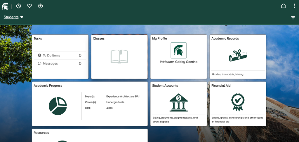
This is my homepage for the SIS system at MSU.
Situation
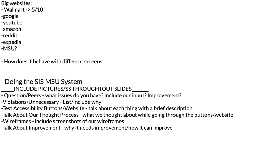
I had to go through the SIS system at MSU for a project in my Experience Architecture class. I worked with one other student, and we had to find a prominent website that is used daily and evaluate its accessibility to users. This project was taken the week right before Thanksgiving break. As I stated earlier, our jobs were split evenly. This means that we came up with the ideas. My partner and I had the same task and went through everything the website offered, and the services. We found bugs within the site.
Task
Our role was to play the jobs as the creators, but also as the users, figure out accessibility and its fixes, and other things like improving the layout. The assignment was to choose between a digital or a physical space and check the accessibility, take pictures or screenshots, talk about the violations, and lastly talk about the improvements and how you’ll do them. My partner and I decided on digital space because it seemed a bit easier for us. We chose the SIS system.
- We researched, documented, elevated, and put all the content into a presentation to present to the class.
- We noticed many unnecessary buttons, like the recents and favorites.
- Too many calendars -> simplify to one
- Enrolling in classes can take time, and it’s a bit confusing
- The overall layout could be simplified.
These were some of my thoughts on the project as a whole and the layout.
Action
- On my part, I tested every accessibility tool, for example, screen reader, mode on, and using tab to navigate.
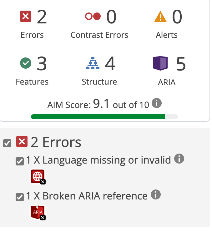
- I ran an accessibility test on the website to check what violations or errors. I checked every content and noticed if it was necessary or if it needed to be removed or added to another tab and combined them.
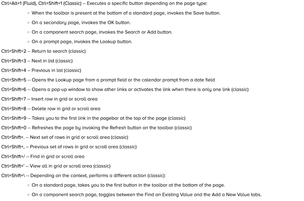
- The shortcuts could be created better as well because they are clumped together, which makes it difficult to read at times.
- Include actual websites that are completed for accessibility help.
2. The layout for the front page could be designed simply.
3. Another route that I went was that I wrote down notes on what students also had concerns with or wished to improve.
My partner and I would come back together and use our notes to then include in the presentation. We also collaborated on Figma and created a mockup of the website with the fixes and improvements.
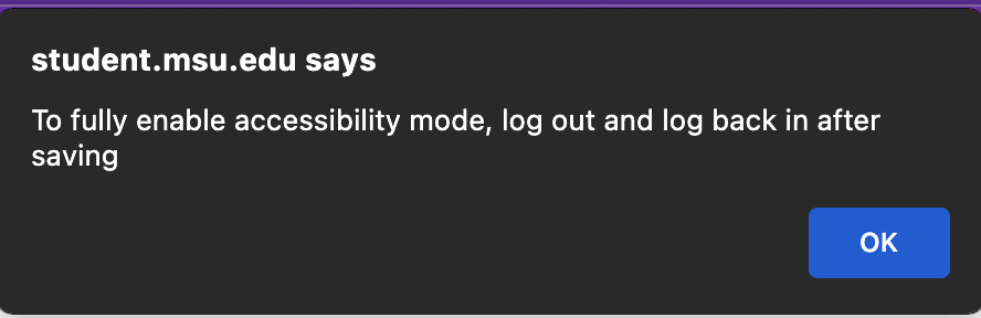
The pictures below are examples of unnecessary icons and tabs, and how accessibility is delayed or doesn’t function properly.


Result
As a result, this would improve the inclusivity and accessibility of the webpage to users. This would be helpful for students with disabilities; furthermore, the layout would be easier to understand.
- If this were to take action, the impact would have improved slightly because it would be designed a bit differently and would take students a while to navigate.
- I think the project went really well, and our professor was quite happy with our work and that we chose the SIS system because it’s used daily.
- I did learn that you have to double-check your work and really think through your process and sites because users are going to be using it and have to make sure it works for everyone.
- I did struggle a bit with Figma in creating the mockup, but I have gotten better since the last project.