

MSU Experience Architecture Homepage
Link: https://xa.cal.msu.edu/
Overview
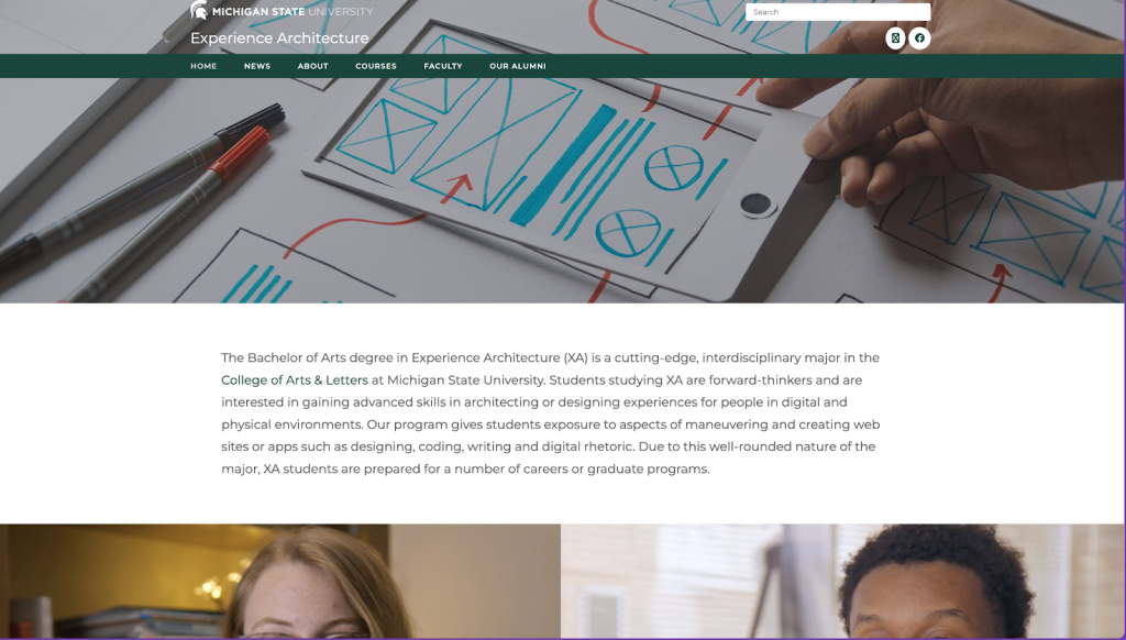
The MSU Experience Architecture homepage is very plain and overwhelming. It doesn’t function with certain information or buttons, which can cause users to develop a bad experience. I worked with other MSU students to get my first experience with the website, and we will discuss how we can improve the functionality and visual elements of the homepage to make it more accessible and easier to read.
This is the homepage for Experience Architecture.
Situation
I needed to look at the Experience Architecture MSU home page for an XA class. We worked in groups of four, picked a section to look at carefully, and discovered anything that was missing or not working. I quickly found that certain buttons made navigation difficult. The layout was also overwhelming to certain users.
My Responsibilities
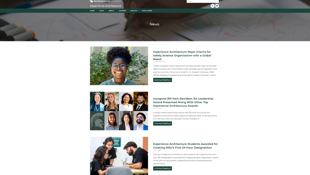
We positioned ourselves as the architects of the website, and our group decided to focus on transforming the layout and fixing the little bugs that weren’t working. The assignment was to examine our assigned website and see what we could improve, and we chose the MSU XA homepage. Our group was split into different sections of the homepage, and I was assigned the news category; the others included the specific articles, and another had the same job as I did. I had to look closely and click links or buttons to see if they worked. I found bugs within the website that weren’t working. I was also looking at how to make the website function while still looking professional and simple to read.
Action
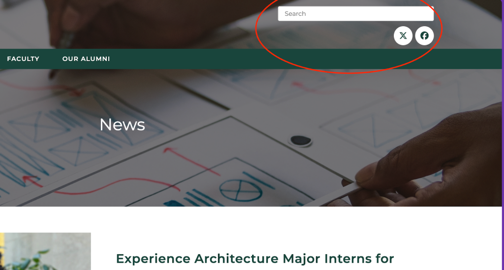
I first looked at different sections of the website, like the overall descriptions of the articles, the navigation, and the wayfinding used. I would jot these down to help remind myself. I would also notice any improvements needed to make the quality better. I would click through to make sure the functions worked correctly, which is where I found of my mistakes of the search bar.
- The website had a search bar, but it didn’t function properly and was used as decoration.
- The layout doesn’t account for Zoom +/-, there’s a lot of space, and it doesn’t fit every screen.
- There wasn’t a way to search articles using keywords.
- The layout didn’t fill out, and it’s stuck in a single category.
After all these notes, we came back as a group after a specific time. We discussed the problems, but also possible solutions to the layout and small bugs. Some of these fixes would be to create a mockup sketch in Figma and resegin the little things, while the actual coding and functionality would be the coding base. The redesign would be removing unnecessary information and revising the style, like fonts and colors. This would create a more professional and straightforward look that can be read more easily and understood better.
Results
As a result, these improvements would enhance the quality of the design for readers. As for success, it would be 50/50 because many might like that it’s overall simpler to understand, while others might have liked the old layout. The challenges I faced would be with Figma because im still a beginner, and it can be confusing at times. In the end, this would help students and anybody associated with MSU and the program, and create a better experience that leaves them with what the program is or other information learned.